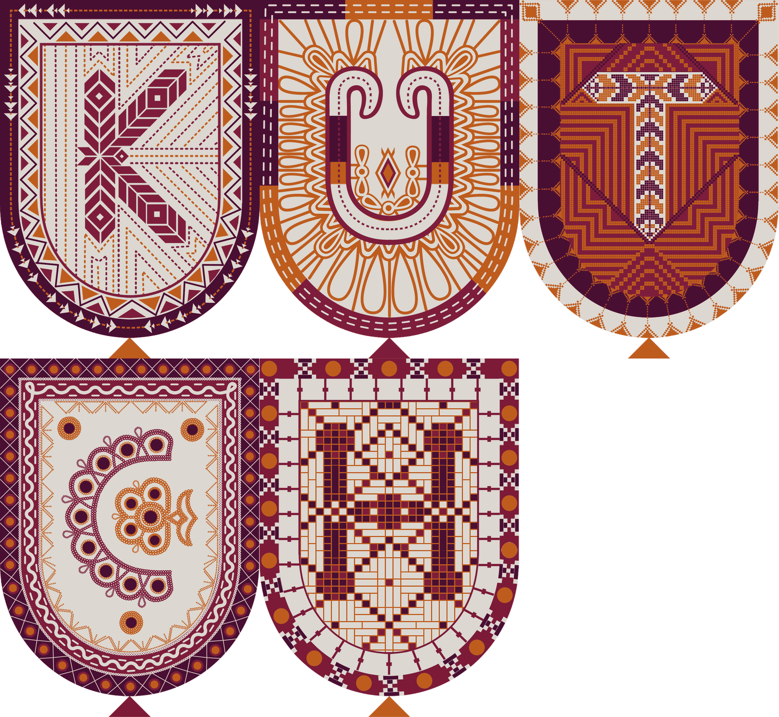
Kutch Identity
Visual identity in the form of a ceremonial toran - an apt metaphor for the people, community, and crafts of Kutch

Organisations we worked with - Kala-Raksha, Shrujan, Qasab, SIDR, Vankar, Jabbar Khatri and Khamir.
Crafts we worked with
Embroideries: Suf, Rabari, Jat, Ahir and Khameer.
Print: Ajrak and Bandhani.
Weave: Bhujodi Weaving and Mushru
and Lacquer Wood.
Creative Director - Ishan Khosla
Designers - Charvi Dixit, Aditi Rajwar, Wolay Sharma, Shonal Awasthi
This project was completed during the internship at Ishan Khosla Design, as a part of studio's design team, under the guidance of the creative head Ishan Khosla.
Please visit www.ishankhosla.com for more details about the studio and the project.
The Logo is derived from the form of the toran because it is an important ritualistic textile object.
It is regarded as a sign of auspiciousness as well as of protection from evil spirits. The toran is used to welcome the Gods as well as guests into one’s home. It is considered that the textile torans have evolved from the ancient leaf version of the toran (still seen today) made from leaves of the Mango or Asoka (meaning no grief) tree.

Anatomy of the Full Logo

Process
We started out by creating a digital version of the logo, which was then later made into a physical toran by the numerous artisans we engaged with. We felt it was important that the logo represents as many communities and their identities via the crafts they engage in. The challenge was to select a few crafts that represent a land where there are over two dozen styles of embroideries; numerous styles of weaving; split-ply braiding; multiple communities practising printing and dyeing; and numerous non-textiles crafts such as wood carving, copper bell making and turned wood coated with lacquer.
Another aspect to consider was the contradiction between the simplicity and minimalism of the logo versus that of the sensibility of traditional communities, where intricacy and detail are valued more because of the workmanship and refinement. That the colloquial word for embroidery is bharat kaam or “filling work” further supported the need for an ornate and detailed logo to represent the richness of the myriad Kutchi crafts.

Final Digital Letters

Final Physical Letters

Physical Toran
Once the digital logo was completed, a physical toran was constructed for the show in Japan. We decided to make this a large toran with “pillars” to encompass the entranceway of a mud hut being made at the Hanku Yu store in Osaka. Working with the various groups has been fulfilling though challenging.


Application

